Earlier this summer, I received one of the more challenging design requests to arrive in my inbox: build a brand in rural Nigeria.
The assignment was in support of “My Voice”, an open source tool for citizens to provide feedback on select government programs that Reboot was developing in partnership with the World Bank. We were preparing to launch a pilot of My Voice in Wamba, Nigeria with a focus on collecting patient feedback from local healthcare clinics through an SMS-based survey. I was tasked with building the brand system to introduce—and encourage the use of—the My Voice tool in a new community.
Wamba is a rural county in the northeast corner of Nasarawa, a state right in the heart of Nigeria, and indicative of the many rural areas across Nigeria where healthcare service delivery occurs with very limited input from the patients themselves.
Here in New York, by contrast, I have many opportunities to comment on the quality of care that I receive. When I choose my doctor I use ZocDoc, a site similar to Yelp but focused entirely on healthcare. The site presents a long list of doctor options, which I can narrow down by specialty, distance from me, patient rating, and whether I want a male or female doctor. After reading the reviews left by other patients, I can make my final choice and visit their office for an appointment—vote with my feet, essentially. Following the appointment, I can enter my own feedback and review of the experience. A doctor or practice with too many negative reviews is not going to be seeing many more patients.
In Wamba, patients don’t choose their doctor. Typically, the doctor they see is in the nearest clinic they can access. That’s often the only option. When options don’t exist, the ability to shape your own experience doesn’t exist either. You can’t weigh options through others’ reviews, and you can’t vote with your feet. This situation challenges clinics too, which have to deal with whatever health issues come their way, regardless of available resources, staff, or proper equipment. Both sides of this service relationship want better outcomes, but have limited ability to realize them.
We built My Voice to help change this status quo, to provide patients with an opportunity to input on the quality of care that they receive and to provide clinics with more information about their patients’ needs. But just like ZocDoc—or any other crowd-sourced information platform—My Voice is only helpful if people are using it. The most intuitive, useful tool would ultimately prove useless if it failed to engage patients and health clinic staff.
This is where the need for brand building came in. We needed to build a visual identity to create awareness, define targeted messages to promote adoption, and ensure consistent communications to facilitate use. That much is clear in theory. Here’s how we did it in practice.
We knew from the outset that the visual identity system needed to be firmly rooted in the context of the culture to effectively resonate with those using the service. In Wamba, that meant a visual language that was easy to navigate and straight to the point since many prospective users would be illiterate. We focused on building a system that would be highly visual, easy to repeat, and easy to recognize. We wanted to realistically show what using the system looked like. Photographs, therefore, became key to the system, instead of iconography or illustration.
In the course of our research, we had taken plenty of photos that could have been visually appropriate. But they weren’t ethically appropriate since we hadn’t informed the individuals in those photos that their images would be used for anything beyond our own research. We keep a strict photo policy of informed consent and responsible use. We ensure that people know how and where their photos will be used, and that they are always asked permission before we take their picture.
So we needed new photos.

We revisited Wamba General Hospital and identified scenes that would be easily identifiable as clinics in Nigeria: periwinkle-colored curtains and a waiting room filled with wooden benches. We place our own team members into the scenes and took their pictures. We also got permission from clinic staff to use their photos in posters, flyers, and other materials for the My Voice system.
Having the right images is always important, but making sure we get them in the right way is much more so.
With the visual identity defined, next we needed to work on our messaging. Patients, health clinic managers, and health clinic staff all experience healthcare services differently, based on their unique roles in the system. Our messaging, therefore, needed to be tailored to demonstrate the benefits of My Voice with respect to each of their different experiences. Here’s where we landed:
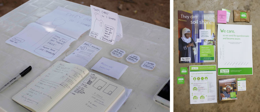
Patients: “They care, so I share.” Patients wanted to know that their feedback was going to a trusted place, and that they could feel safe sharing. These messaging themes let patients know that by sharing their stories, they are helping their hospital to improve and better serve their needs.
Health Clinic Management: “I care, so I become aware.” The primary benefit to health clinic management is that the My Voice data provides insight into their hospital’s performance. This messaging theme tells them that by becoming aware of what their patients are experiencing (both positive and negative), they can be better informed about changes that will improve patient experiences.
Health Clinic Staff: “I care, so I send the questionnaire.” This was the toughest. We realized early on that the clinic staff were truly the “gatekeepers” to the process, since they have the task of informing patients about My Voice and registering them for the service. But if they view the program as a threat to their jobs, they’re certainly not going to use it. We addressed this by positioning them as an important role-player in the system. Their targeted message emphasizes expressing care towards patients, along with the importance of their position in the system, by giving patients the opportunity to share their stories.
Finally, we had to decide the most appropriate communications materials to ensure patients were aware of and knew how to use My Voice. For this, we looked to the context of the service. We asked ourselves: what did the environment and the design of the My Voice system offer in terms of touch points to design materials that would reach our target audience groups? Broadly, we developed three kinds of communications materials:
Promotional Materials. These include posters, table tent cards, and stickers. The posters are for clinic waiting room, treatment rooms, pharmacies, and offices. The table tent cards are for the clinics’ registration desks. One side faces the patients as they check in and out of the clinic. The other side faces the nurse or hospital staff registering them into the My Voice system. This interaction is an important one, making the registration desk a visible part of the system for both patients and staff. Lastly, the stickers are for placing on pharmacy bags as a reminder once patients leave the clinic. They are also given out at the registration desk as give-aways.
User Guides. These are for both patients and clinic staff to further aid in explaining the system. Patient user guides are folded into patients’ hand cards when they check out at the registration table. The patient hand card is a little pink booklet that tracks an individual’s medical history and important ID numbers. Since these documents are well-cared for, it ensures that the user guide would be kept close at hand and act as a visual reminder once patients leave the clinic.
Interactive Weekly Performance Posters. These posters help build awareness too, but more importantly close the feedback loop for patients inputting into the system. Here clinic staff fill in the survey data from the previous week. This demonstrates to both patients and clinic staff that their responses aren’t going into a black hole of bureaucracy.
Building the My Voice brand and all of its requisite components was a unique and exciting design challenge, to say the least. Often designers are tasked with changing behavior. In this case, the job was to create behavior in a very complex context. Since My Voice launched in mid-July, it’s been exciting to see that behavior begin to take root, but our work is far from complete. As the pilot period comes to a close in early September, we’ll be looking to feedback from patients, health clinic staff, and management to help us perfect both the My Voice tool and the brand we’ve built around it.


