Last fall, I spent a day talking to a public defense attorney about the obstacles she faces every day. That may not sound like a typical day for a communications designer, but research like this is a regular part of my work at Reboot. When tackling social issues, successful visual design elements (like every other piece of a project) have to be grounded in an immersive understanding of the problem.
That particular conversation was part of a pro-bono project with the Brooklyn Community Bail Fund, which is tackling the injustice of the current bail system. As my colleague Dane wrote recently, in the absence of meaningful bail reform, our work with the Brooklyn Community Bail Fund seeks to create a short-term solution. But even short-term solutions are tough. Like maternal health, inclusive banking, and every other challenge we have tackled at Reboot, criminal justice is a complex system of people, laws, and culture. You may wonder: Can a communications designer really play a significant role in creating solutions?
The answer is “yes,” but it requires project managers to incorporate us as early as possible. And it requires visual designers to let go of what we think we know.
The social sector is increasingly embracing the value visual design brings to advocacy and policy reform. Project finding reports have made progress in recent years. We see fewer congested text documents and more well-designed PDFs, complete with digestible data and pull quotes for easy information consumption. Over the last several years we’ve seen even the most influential development agencies takes steps towards becoming a stand-out examples of traditional organizations embracing the role of graphic design. From the World Bank to UNICEF, we’ve been lucky to support these steps.
There is still progress to be made. For example, I could write an entire other blog post about the issues with disseminating some of these reports (hint: the solution probably involves a great communications designer). But more broadly, the sector can benefit by tapping visual designers’ skills in more areas. By incorporating us into a project, especially allowing us to be embedded in the research process early on, development programs can utilize their communications designers to not only promote project outcomes but improve them. (As long as we designers are willing to put end-users’ needs ahead of our own love of aesthetics. More on that later!)
This has been clear in our work at Reboot, which stretches the design team far beyond the usual advocacy. Sure, we do our fair share of report design, presentation formatting, and infographics, but our skills are seen as assets from inception to implementation. That’s why we sent a designer to rural Nigeria for My Voice. And it’s why I found myself wrestling with the murky details of arraignment processes.
As part of a multidisciplinary team working with the Brooklyn Community Bail Fund, Reboot’s communication designers were able to support visual solutions for two specific problems.
The first was for public defenders. Brooklyn Community Bail Fund will pay bail for certain non-violent defendants (see Dane’s post), relying on participating attorneys to recommend clients.
During our research, public defenders and fund administrators spoke about their hectic schedules and the large volume of pressing paperwork. We were concerned that the bail fund criteria may be overlooked amidst the chaos of any given day. There is also a pretty small window of time between a client’s meeting with their attorney and when their bail is due; if that window closes, they are on the bus to Rikers Island.
In order to make the criteria integrate well into an already hectic court day, we designed an intuitive form that can be understood in just a few seconds. It might not be the flashiest piece of design, but its simplicity removes unnecessary obstacles to using the criteria and mitigates mistakes in the process which could skip over qualified candidates.
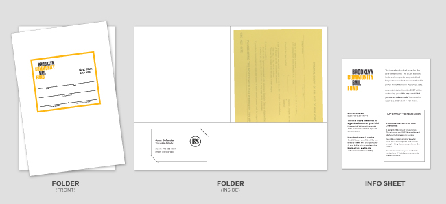
Our second visual solution was important for the bail fund’s long-term financial sustainability. Since the fund is only replenished when clients show up to their court dates, we developed a strategy and supplemental materials to communicate the importance of coming back to court.
Through our research, we uncovered a key insight: A good public attorney—one that respects his or her clients and clearly emphasizes the costs of failing to appear—seemed to be the main determining factor in whether or not a client would return to court. So, we sought to develop visual materials and cues that would supplement the ability of all attorneys to emphasize the importance of the court date. The main solution was a folder to house all of the necessary information, which was formerly on an easily misplaced, confusing piece of paper. The new folder looks official and important and is more likely to stay at the top of clients’ minds. It holds an official court slip, statistics about the positive outcomes of appearing in court, the public defender’s business card, and clearly communicates the court date and location:
These two small, visual solutions are an integral part of the entire design team’s work creating a process that serves people and their families during a difficult, emotional time. They were possible because the communications design team was deeply involved in the research process, and because all team members understood and made space for communication designers to contribute value.
It’s important to note that neither of these solutions was designed to win aesthetic awards. “Make it look pretty” is not enough, and is sometimes beside the point. One of the biggest lessons many designers may learn through participating in research is to compromise beauty for effectiveness. More often than not, we have to let go of what we think we know.
There are more than enough (often humorous) anecdotes circling around the internet about client feedback ruining the perfect piece of graphic design. And while I have had my fair share of frustrations with vague, confusing, or aesthetically-demeaning feedback, Reboot’s research process has taught me the value of understanding the end-user perspectives.
My first project at Reboot involved working with The Niger Delta Citizens Budget Platform (NDCBP). The prompt was to create a logo that would express the credibility of this small, innovative local advocacy organization. My first attempt consisted of a series of contemporary logos, but I soon learned that what is visually credible in America would not convey the same associations to the Nigerian public. Although the logo I found most compelling was left behind, the process of listening and understanding led to a better, more contextually appropriate logo. No matter where we’re working, designers have to learn to speak the visual language of the people we serve.
Luckily, we have help: Our work benefits from a multidisciplinary team, with a diversity of skills and perspectives. At the end of the day, we are communications designers. We don’t always know best, so we have to learn from the context and the support of a great team of researchers.
It’s not always possible to involve visual designers as early as we might like. It can seem like there is never enough money or time; doing good work requires flexibility, and visual designers are always going to have to play some amount of catch-up to understand a project as deeply as the project manager or field researcher. But whenever possible, bringing visual design into the early stages of the project helps support the outcomes for the long-term.
Read more about the Brooklyn Community Bail Fund on their website at http://www.brooklynbailfund.org/


