Our ever-growing access to information and tools has profoundly changed the way we can use, digest, display, and share data. Put an internet connection and a laptop together and you have a tool that can empower people—regardless of experience—to visualize and dictate data’s meaning and impact.
But as data use becomes more frequent, more creative, more far reaching, is the information we share and the way we share it using data accurately? Are we sharing knowledge responsibly or perpetuating the obscurity of data?
In a recent post, “Can Data Visualizations Help Mediate Between the Worlds of Research, Policy, and Practice?” AidData addressed data visualization—a way to visually represent raw and unprocessed information in a clear, sharable, and relatable way. The abundance of data we have access to is certainly overwhelming and, as the post suggests, a “vortex”. Data visualization offers hope for a shift from a whirling mass to something more real. The above post stressed the need to convey “relatable information at a glance,” highlighting single layers within complex data as a means of reaching audiences previously naïve to the information presented.
But while compelling and accessible, data visualization often falls prey to the very data misrepresentation that it seeks to avoid. The intention of reaching and being relatable to many people is noble, but delivery often seems to perpetuate rather than tame the swirling vortex.
Take for example the ideal set in the above AidData article. At first glance, we can see that “My Fridge” consumes more electricity per capita than Ethiopia, Tanzania, Liberia, Nigeria, Kenya, or Ghana. We’re led to the shocking conclusion that our visualization creator’s fridge is more advanced than these African nations.
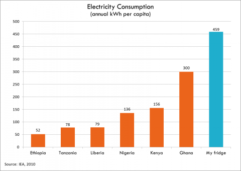
But what is this visualization not telling us? Why do these nations consume low levels of electricity? Is it a reflection of electricity use or access? How does information compare to previous years? What are we supposed to do with this information? To its credit, the graphic has the ability to speak to fridge owners. But its purpose is hazy.
If the purpose of data visualization is to join previously separate worlds, it needs to go a few steps further; from being merely shocking to accurately compelling. It needs to build deep understanding through the creation of something that is both relatable and substantive. Visualization offers a lens through which we can view information, but that lens shouldn’t overlook context, causation, or other contributing factors behind the data.
This becomes especially important as data becomes readily available through open data initiatives and technology innovations. Data visualizations have the power to inform policy, service design, and our collective thinking. Shallow messages won’t cut it—real people and real lives are often found at the roots of data; they are a crucial component of the context we need to encourage understanding of citizens affected by policies and programs. People are the substance behind the data, and policymakers need to make decisions based on people, not numbers, to design inclusive policies and services.
For example, in a recent attempt to visualize data on public spending, we started with data on cost increases for public service projects. It quickly became clear that visualizations headlining 200% cost increases would create impact at first glance, but misrepresent the story behind the numbers. There are costs that simply weren’t budgeted for, and there are also costs that are necessary to deliver the best possible outcome.
It became clear that we had to show a greater depth of information to get from a data-driven narrative—“This project cost 200% more than it was supposed to. It was a budgeting failure.”—to a narrative embedded in context—“The project cost 200% more than was budgeted for, but its scope (road length) doubled and included additional actors and aspects (road materials, walkways, streetlights, drainage) not accounted for at the outset.”
Data consumed through visualizations “at a glance” runs the risk of discouraging engagement and understanding of the people the data is trying to represent. That said, we’re also up against the daily challenge of keeping up with short attention spans in our fast-paced digital world—anything that doesn’t immediately connect to the viewer is likely to be overlooked, losing the battle to Twitter in a neighboring browser tab.
But we can’t overlook the fact that the causation or insights behind related data simply don’t get the consideration they deserve in a graph with a five-second lifetime. And as designers it’s our responsibility to visualize data in a way that embraces the inherent complexity behind numbers.
As Victor Papanek once wrote, “Design has become the most powerful tool with which man shapes his tools and environments (and, by extension, society and himself)…This demands high social and moral responsibility from the designer. It also demands greater understanding of the people by those who practice design and more insight into the design process by the public.”
Let’s look beyond the seduction of graphs seeking a shock factor, beyond quick one-glance charts. According to John Emerson, “People who might not be persuaded by raw numbers or statistics may be more likely to understand and believe what they see in a chart or graphic.” It’s our job to facilitate, not manipulate, their understanding.

